
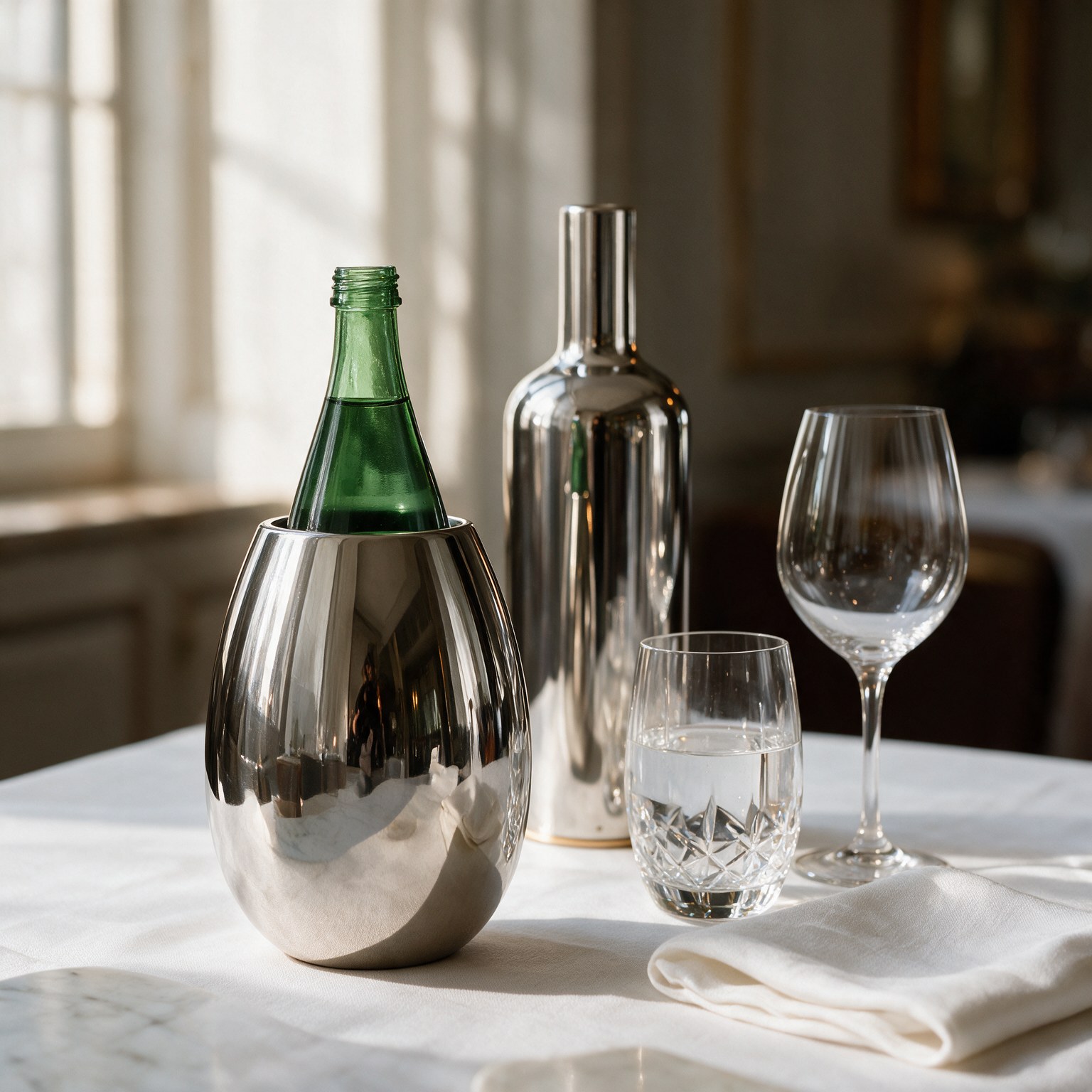
The most memorable tables are never built around a single object.
They emerge from relationships: between light and material, height and proportion, transparency and reflection. Their character is created through a sequence of gestures: unfolding a napkin, lifting a glass, pouring water, presenting wine.
When each of these elements speaks the same visual language, the table becomes more than a simple setting. It becomes a composition.
By bringing The Drop together with a K-over bottle cover, two essential presences of conviviality enter into dialogue. Different in their proportions and roles, yet united by a shared vision, the two bottle covers create a coordinated service in which water and wine contribute equally to the atmosphere.
Two bottles. Two rituals. One idea of hospitality.
Beyond the Mise en Place
A table curated down to the smallest detail cannot be reduced to the simple choice of plates, glasses and cutlery. It must be considered in three dimensions.
The height of a wine bottle creates a vertical accent. A water bottle introduces a second volume. Glasses capture and fragment the light, while textiles provide softness and continuity. Every object changes the balance of the whole.
When bottles remain uncovered, their labels and commercial identities can compete with this composition. Different colours, typography and glass shapes generate visual noise, particularly in interiors where every detail has been carefully selected.
K-over wine covers and the new Drop replace that irregularity with two pure, complementary forms.
The taller bottle cover gives authority to the presentation of the bottle. The Drop, with its more compact and rounded profile, provides balance. Together, they create a rhythm across the table: a relationship between verticality and softness, ceremony and continuity.
This is not simply coordination. It is table architecture.
Water and Wine: Different Roles, One Visual Language
Wine and water perform different functions during a meal.
Wine often marks a precise moment: it may introduce the menu, accompany a course or celebrate an occasion. Its arrival at the table is anticipated, and its presentation is part of a ritual.
Water has a quieter but constant presence. It accompanies the entire experience, connecting one course to the next and allowing the palate to rediscover freshness and clarity.
These distinct roles are reflected in the forms of the two bottle covers. The K-over wine cover enhances the importance of the selected bottle, while The Drop gives visual presence to the element that remains beside it throughout the meal.
Neither needs to imitate the other. Their harmony comes from belonging to the same design vocabulary: sculptural silhouettes, reflective surfaces and an attention to presentation capable of transforming service into a true ritual.
The result is a table where nothing appears secondary.
The Art of Pairing Finishes
Coordinating water and wine bottle covers does not necessarily mean choosing two identical finishes. As in interior design, harmony can arise from repetition, nuance or contrast.
Tone-on-Tone Elegance
Using coordinated finishes creates a harmonious and continuous composition.
Silver, luminous and timeless, pairs particularly well with crystal, white linen and marble surfaces. Gold, on the other hand, introduces a warmer and more ceremonial presence, ideal for gala dinners and private celebrations.
Tone-on-tone combinations allow the shapes of the two bottle covers to become the principal visual element of the table.
The Strength of Contrast
Combining different finishes makes the composition more dynamic.
Black Nickel can provide an architectural counterpoint to the brightness of stainless steel. Pink Gold can soften a composition dominated by silver tones, while a gold accent can create a focal point beside a more restrained water bottle cover.
Contrast is especially effective in contemporary interiors, where a few carefully chosen objects help define the visual identity of the entire room.
A Dialogue with the Interior
The most refined choice begins with the surrounding environment.
The finishes can echo details already present in the space: the frame of a lamp, the tone of the taps, the base of a table, the warmth of wood or the veining of marble.
In this way, the pairing of The Drop and a K-over wine cover is not merely a decorative element added to the room: it becomes an integral part of its aesthetic.
A New Signature for Fine Dining
In contemporary fine dining, culinary excellence is only one part of the experience. Guests also remember the choreography that accompanies the meal: the welcome, the way each course is served and how familiar gestures can be transformed into something unique.
A coordinated presentation of water and wine offers restaurants the opportunity to create precisely this kind of gesture.
When both bottles arrive at the table dressed in recognisable forms, the service immediately communicates a precise intention. It tells the guest that nothing has been left to chance, and that water, too, is presented with the same care reserved for the wine list, the menu and the tableware.
The covers also create a strong visual focal point. Their reflective surfaces interact with the dining room and naturally invite photography, allowing the identity of the restaurant to extend beyond the table itself.
For hospitality professionals, they are therefore far more than decorative accessories: they are an integral part of a recognisable, coherent and repeatable ritual of service.
From Private Residences to Yachts
The dialogue between The Drop and the wine covers adapts to a wide variety of settings.
In a private residence, the two covers elevate an intimate dinner without making it excessively formal. At weddings or anniversaries, they bring unity to the table and help underline the solemnity of the occasion.
In luxury hotels and resorts, a coordinated presentation can create a common visual thread between restaurants, suites and private dining experiences. On board a yacht, the compact composition adds a touch of elegance while respecting the clean, essential aesthetic typical of nautical interiors.
Personalisation offers a further level of distinction. A logo, family crest, monogram or emblem can make the two covers part of a unique identity, tailor-made for a specific venue, vessel or event.
The table thus takes on an unmistakably personal character.
The Complete Ritual of Hospitality
The true meaning of luxury lies not in excess, but in coherence.
It is the sensation that every object has been chosen for a precise reason and that every gesture has found its most natural form.
When water and wine are presented according to the same aesthetic vision, the entire table acquires greater balance and authority.
The K-over wine cover enhances the bottle chosen for the occasion; The Drop completes the experience by giving water an equally considered presence.
Together, they transform two everyday gestures, pouring water and serving wine, into elements of a broader ritual made of aesthetics, attention and care for hospitality.
Because a remarkable table should not have a single protagonist. It should create a dialogue in which every element contributes to the beauty of the moment.
Discover all the K-over covers and create a coordinated presentation, tailored to your table, your venue or your identity.

